Showing posts with label Dunhams Manor Press. Show all posts

Thursday, July 13, 2017

Anatomy of a Cover: Muscadines

Cover with variant font placement.


Last year Dunhams Manor Press published S.P. Miskowski's Muscadines, which met with deserved attention and praise in the weird fiction community, and now- this weekend!- the book is up for a Shirley Jackson Award for Best Novella. To celebrate the occasion and perhaps draw a bit more attention to Miskowski, whose latest collection I Wish I Was Like You was just published by JournalStone, I offer a look at the Muscadines cover art development.


These eight thumbnails show how quickly S.P. and I honed in upon the Muscadine grape and a wine bottle as a cover image, and the addition of a woman's hand made the design both sexy and dangerous.


 Hoping to bring an element of horror into the cover art, I experimented with faces of men screaming, pleading, writhing in pain, their features twisted reflections on (in?) the bottle. To make the faces more authentic, I bought a bottle of wine, peeled the label off, and drew the faces I made in white chalk on black paper.

A Dunhams Manor collectible, the bottle went unopened until KrallCon 2016, where it was unceremoniously emptied and tossed. I should've kept it on my shelf and continued to make funny faces into it...


With the elements in place, I did larger and more finished drawings to test their effectiveness. S.P. didn't think it was necessary to see more of the woman behind the bottle other than her hand, and of course, she was right. My wife Laura helped get the lighting correct by posing her hand with the bottle.

These chalk drawings were all donated to Dunhams Manor Press to be sent to subscribers- yet more DMP collectibles! Hope this original art finds its way to happy readers of horror...


Finished pencils and final scratchboard image, 8" x 10"

Added bonus: pages of surreal portraits inspired by Francis Bacon, whose work prompted Miskowski to pen this novella in the first place! With such inspiration, you know any resulting story will be wonderfully twisted and bizarre! To conclude, best wishes to S.P and Muscadines at ReaderCon this weekend!


Tuesday, May 30, 2017

The Castle-Town Tragedy on Kindle

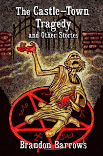
Brandon Barrows' The Castle-Town Tragedy and Other Tales of Carnacki, the Ghost Finder, released by Dunhams Manor Press two years ago, is finally available on Amazon's Kindle. This digital version does not have my interior illustrations, but keeps the cover art and includes an additional story by Barrows, as well.

Monday, April 24, 2017

The Stay-Awake Men design


Coming from Dunhams Manor Press in 2017, Matthew M. Bartlett's next collection of weird fiction, The Stay-Awake Men.

This cover proposal is pen-and-ink with white chalk on toned paper.

Monday, March 20, 2017

A Volume of Sleep, Illustration I


An illustration for Jayprakash Satyamurthy's upcoming collection, A Volume of Sleep.

The pen-and-ink drawing of the shrine was digitally added to an ink wash painting on a 5"x7" clayboard to achieve the background's surreal form of the deity's earthly manifestation.

Expect A Volume of Sleep from Dunhams Manor Press in Summer 2017.

Monday, February 20, 2017

Ventriloquism Promo Art III


This scratchboard image was created to promote the audiobook version of Dunham Manor Press' The Secret of Ventrioloquism.

This chilling collection is narrated by the author himself, Jon Padgett.


Monday, November 21, 2016

Ventriloquism Promo Art II


Another early cover design for Jon Padgett's The Secret of Ventriloquism, chalk on black paper.

Sunday, November 20, 2016

Ventriloquism Promo art 1

When designing a scratchboard illustration, I'll try ideas in chalk on black paper first to see how the contrast will work, and these concept drawings, even when unused, can become stand-alone workable images. For a striking cover to Padgett's The Secret of Ventriloquism, I wondered about Death as the ultimate Ventriloquist- would the dummy be Death's mouthpiece? Or maybe every living human body is but a dummy, which is close to the book's theme, so in this chalk drawing the doll became more human, childlike and afraid.

When another design was chosen by the author for the cover, this image served as promo art to be shared on social media.

Saturday, November 19, 2016

Anatomy of a Cover: The Secret of Ventriloquism

For the cover image of The Secret of Ventriloquism, I began with designs that featured a ventriloquist's dummy, and played with expressions of fear and hate- should the dummy be a witness or a construct of evil?


Author Jon Padgett, a ventriloquist himself, worked closely with me on the cover and shared images of his own vent doll, Reggie, though he steered me away from Reggie's likeness, suggesting the following excerpt from his story "The Infusorium" as inspiration:

"The remains of the thing’s yellowed, shriveled skin cracked across its face like desiccated sand. Its mouth hung open to reveal a single line of small, dark teeth. The hair was black and slick, almost as if painted high on its head, giving the illusion of premature balding. Below the neck the child-thing seemed more insect than human. Too many arms, or were they legs? Whatever the case, they were far too long and jointed. Anyway, I had no idea how Guidry could bring himself to touch the thing, let alone cuddle up to it. But worst of all, the thing’s eyes—its great, round googly eyes. I’ve never seen eyes like that on a human being. The eyes of a doll, of a shark—still intact in its head."


The dummy's countenance went through an eerie transformation that hints at the unsettling stories in Padgett's first collection.

Once the image was etched to scratchboard and scanned, graphic designer Anna Trueman added the title banner to the front cover and spine, making it the classiest-looking thing I've worked on to date. The final product, as seen in Padgett's hand below, was a collaborative effort between Jon, Anna, and myself, one I feel privileged to have been party. 


The Secret of Ventriloquism by Jon Padgett is available in hardcover, paperback, and eBook from Dunhams Manor Press and can be ordered online here.


Monday, November 14, 2016

Design Sketches for the Next Dunhams Manor Press Hardcover

Working on new images for the next Dunhams Manor hardcover, a collection by Jayaprakash Satyamurthy. This sketchbook page from the design process is one of the original art pieces to be included with a random subscription.
Ink, chalk, and ballpoint pen on 5.5 in. x 8.8 in. toned paper


Sunday, November 13, 2016

"The Secret of Ventriloquism" Illuminated Manuscript pages


Some of the art on the manuscript pages.


To help Dunhams Manor Press with their line of limited hardcover books, at the beginning of the year I offered to donate a piece of original art with each subscription. Designing the scratchboards for the covers and interior illustration generates stacks of sketches that sit in sketchbooks or are simply discarded in the recyclable bin, and if they got into the hands of readers, publisher Jordan Krall and I thought they'd make for a unique collectible. With the release of Jon Padgett's The Secret of Ventriloquism imminent, I spent the Veteran's Day weekend drawing and painting illustrations on pages of the manuscript sent to me by the author, thinking I'd only do a few... and I became so engrossed in Padgett's stories once more, I went on to create a series of new works that would've easily fit in the book. Each Dunhams Manor subscriber will receive an original "illuminated manuscript" page from Jon's collection.


Watercolored manuscript pages of Jon Padgett's "The Secret of Ventriloquism"

Doing the pages in quick succession, these images explore the themes and mood of Padgett's collection, and this project gave me the chance to revisit some of the imagery, like the blackened screaming skeletons of "The Infusorium." Seen as a set here, the evolution of design can be traced from drawing to drawing, honing the bizarre anatomy with each attempt.

I'm positive readers of weird fiction will enjoy Jon's first collection, The Secret of Ventriloquism, which is available in paperback, eBook, and limited edition hardcover from Dunhams Manor, and I look forward to working on upcoming titles by Jayaprakash Satyamurthy, Matthew M. Bartlett, and Jordan Krall himself. While I doubt I'll have the time to do another series of "illuminated manuscript" pages like these, subscribers can look forward to receiving more unpublished art from other books in the near future.


Sunday, August 2, 2015

Designing the cover for Brandon Barrows' new book


I'm excited by my recent involvement with Dunhams Manor Press, and I've committed to illustrating ten limited-edition hardcovers to be published by them in 2016. Working on the cover for Jon Padgett's The Infusorium earlier this year was a true learning experience, and brain-storming with Jon and editor/publisher Jordan Krall produced a stack of sketches. My cover illustration for Brandon Barrows' book, The Castle-Town Tragedy and Other Stories, resulted in a similar array of art as I bounced ideas off the author, seeing which resonated with him. Since it's my hope to use this blog as a way to show the development and process behind the various projects I'm in, I thought Barrows' book would be an excellent place to start, since it will be the first book released, likely by November 2015.

Pages from my sketchbook done as I read Barrows' manuscript. He singled out an image on the second page for me to work on.
As I read the manuscript, I looked for common themes or particular scenes that would make an exciting cover, and I knew immediately it had to be Carnacki's supernatural encounter of the first story. Even before I had finished reading, I was sketching the ghost outside the castle's gate, using different angles to make for an interesting design.

White pencil on black paper to simulate a scratchboard look.

The next step was to elaborate upon the simple sketch by making larger and more detailed drawings on black paper that would resemble the look of a scratchboard. Both the author and editor liked the image on the above left, which looked down on a figure pleading to the heavens for justice.

sketchbook pages
 
final sketch and aborted cover scratchboard


I continued to work on the pose and background ideas such as the gate and Carnacki's electric pentacle, and when I thought I had everything in place, I drew a pencil sketch the same size as the 8x10" scratchboard. This sketch was used as the scratch template, which I transferred to the scratchboard as faithfully as possible. Once free of the paper, though, I'm free to elaborate with fine detail and shading as I scratch away the black surface with a nib. I was content with the stylized figure, the gate, and the pentacle on the cobblestone street, but I became unhappy with the electricity that surrounded the spirit, and the figure didn't seem dynamic or creepy enough to merit belonging on a cover of a horror book. It simply didn't demand attention. I decided to do another scratchboard with a new drawing, and left the original to serve as an interior illustration.

reworked drawings and the second scratchboard illustration

I spent a few days working on the features, contorting my own face and twisting my limbs in the mirror, before my second attempt, and this time I was better prepared. I simplified the design by removing background ornamentation and the wires of Carnacki's electric pentacle, and used the pentagram itself as a design, tying the blood on the hands with the spilled blood on the stones. With the trappings of science removed, the image just screamed of the occult. As a Carnacki the Ghost-Finder book should!

Font variations
The second scratchboard was then painted with a limited palette of watercolors, and after it dried for twenty-four hours, I went back and scratched some color out for highlights- on the bricks, on the bloody hands, on the ghost, and in the background fog. Occult symbols were added to the pentagram design, too. I put together a few different covers in Photoshop that used different fonts, each with their own feel, and I soon abandoned my idea of red lettering for white, which worked with all the highlights, tying the whole cover together.

Looking through the progression of art and ideas, there's a big leap between the initial sketches and finished product, where the scratchboard's details allow for a great degree of realism and exaggeration, and in doing so, I try to conceive of a book that would capture my eye on the shelf (or the internet, these days), one that looks both beautiful and dangerous, and I set out to make that book real with a cover that suits the author's taste and intent, too.

Dunhams Manor Press is printing only about 125 copies of The Castle-Town Tragedy and Other Stories by Brandon Barrows and the other books in their 2016 hardcover series, and they've put together a subscription plan that will save readers money, but this plan is limited to only twenty-five subscribers. As seen above, with all the art generated by a single cover alone, there's plenty of original drawings that can be made available to collectors, so these twenty-five subscribers will also receive art from one of the books. It's satisfying to think some of these sketches won't just sit around my studio, that they'll find a home in someone's Dunhams Manor collection. Information about this series and subscriptions can be found on Dunhams Manor Press' blog and on Dynatox Ministries' storefront.

Whew... that was work. I'll try to post more behind-the-scenes work as I'm able. Next Dunhams Manor hardcover to be illustrated: Jack Werrett, The Flood Man, by Rebecca Lloyd!